
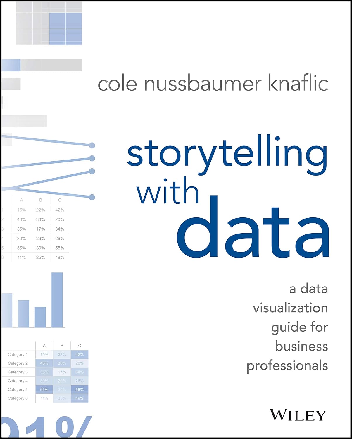
I’ve always been fascinated by the intersection of data and storytelling, so when I stumbled upon Storytelling with Data by Cole Nussbaumer Knaflic, I knew I had to pick it up. I wanted a book that could not only improve my data visualization skills but also help me communicate more effectively with my audience. The promise of turning raw data into compelling narratives was enticing, and I was eager to delve in.
Knaflic’s book did not disappoint. From the very beginning, she emphasizes that "storytelling is not an inherent skill," especially in the context of data visualization. It’s a skill that can be developed, and she breaks down the fundamentals in an engaging way. The real-world examples she uses are stellar—helping to demystify the theory behind effective data presentations. I found her guidance on understanding context and audience particularly helpful. She stressed that the kind of graph you choose can make all the difference, and I completely agree.
One of the major highlights of this book is how Knaflic shows us how to eliminate the clutter in our visualizations. As reviewer Rita N put it, the book is "full of insights," and I couldn’t help but feel the same as I noticed immediate improvements in my work, even after a few chapters. Notably, the visual quality of the book is commendable; Knaflic’s illustrations are both beautiful and practical, making complex information feel approachable.


However, it’s not without its flaws. Some commentators, like J. Edgar, pointed out that while the focus on eliminating extraneous information can streamline visuals, it can also lead to a sense of sameness. I get where he’s coming from. There were times I felt that the book, while emphasizing simplicity, perhaps oversimplified certain concepts. I think there’s a balance to strike; a little complexity can engage the audience and make them work harder to grasp your message.
Additionally, not every element resonated with me. Some readers mentioned that they found Knaflic’s views somewhat opinionated. As a passionate learner, I appreciate strong opinions—they often lead to profound discussions. Yet, it’s worth noting that her advocacy for minimizing "data ink" may not suit everyone’s style or needs.
In her efforts to prepare readers to tell stories with their data, Knaflic has incorporated a wealth of practical exercises that promote application. I felt invigorated to experiment with my dashboards and reports. For instance, I started applying one of her tips about using lighter shades for footnotes; subtle changes like this helped in reducing distractions for my audience, and the results were positively striking.
As a data analyst, I found this book not only educational but also enjoyable. It’s evident from reviewers like Katy that many share this sentiment: the book is helpful for both academic learning and professional application. For anyone involved in data presentations, be it in academia or business, this text is a goldmine of actionable advice. As one reviewer aptly noted, “This was a key point for me,” reflecting how transformative the concepts can be if applied thoughtfully.
Ultimately, Storytelling with Data exceeded my expectations. Yes, there are areas where some readers might want a nuanced approach, but what Knaflic excels at is presenting the basics in an engaging, user-friendly manner. Her focus on storytelling and the importance of visual clarity truly sets this book apart in the crowded field of data science literature.
If you’re looking to enhance your skills in data visualization and storytelling, I would recommend this book without hesitation. Whether you’re a seasoned pro or just starting out, you’ll find valuable insights that could elevate your presentations to new heights.